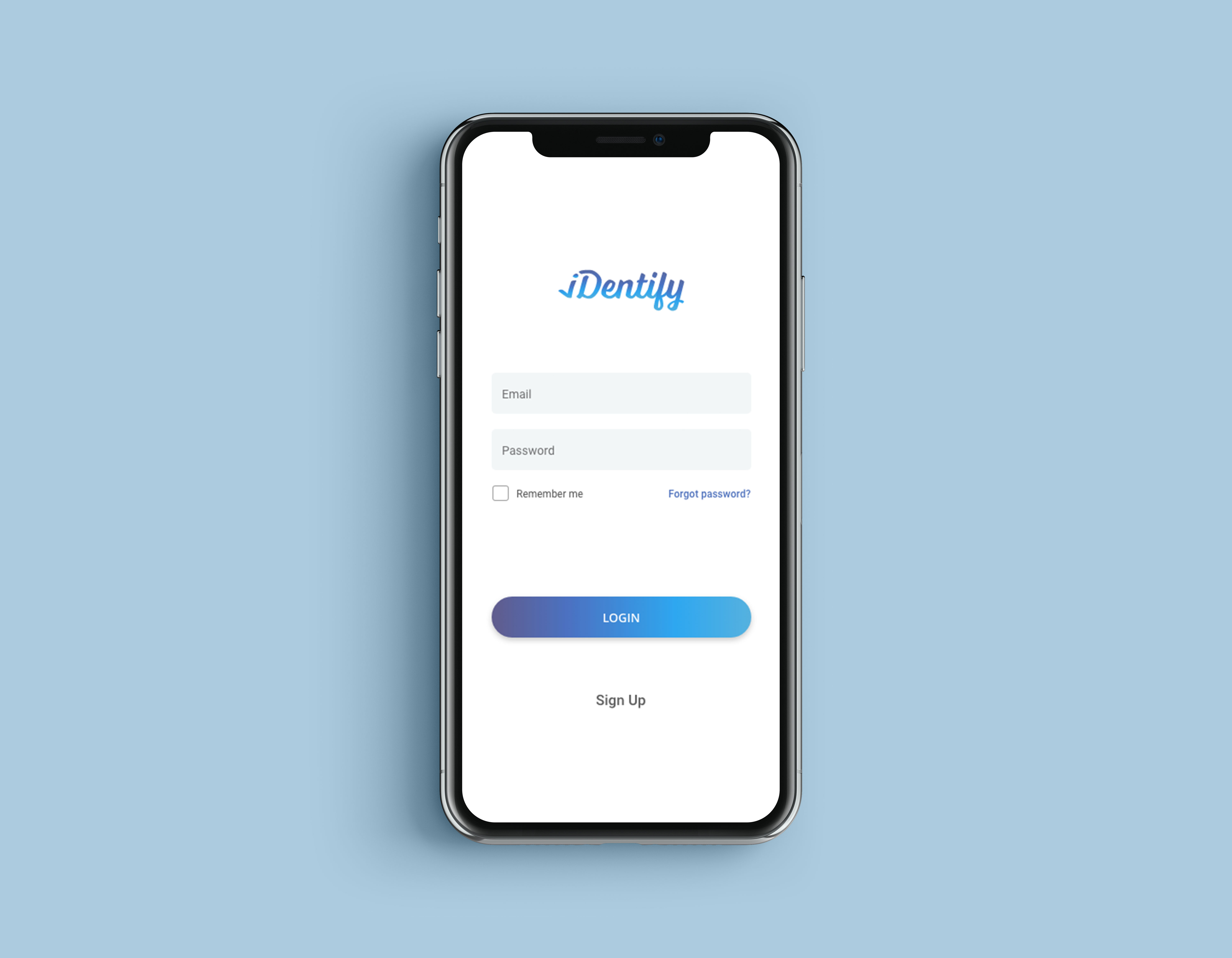
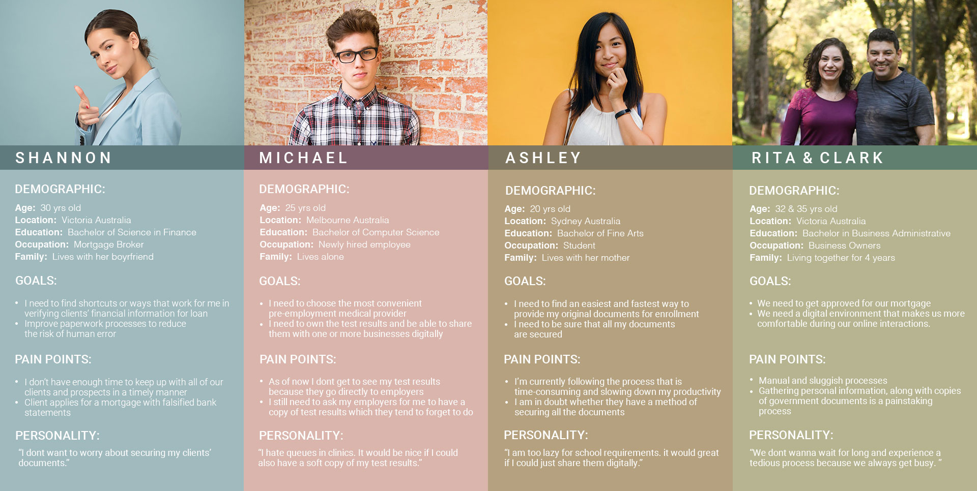
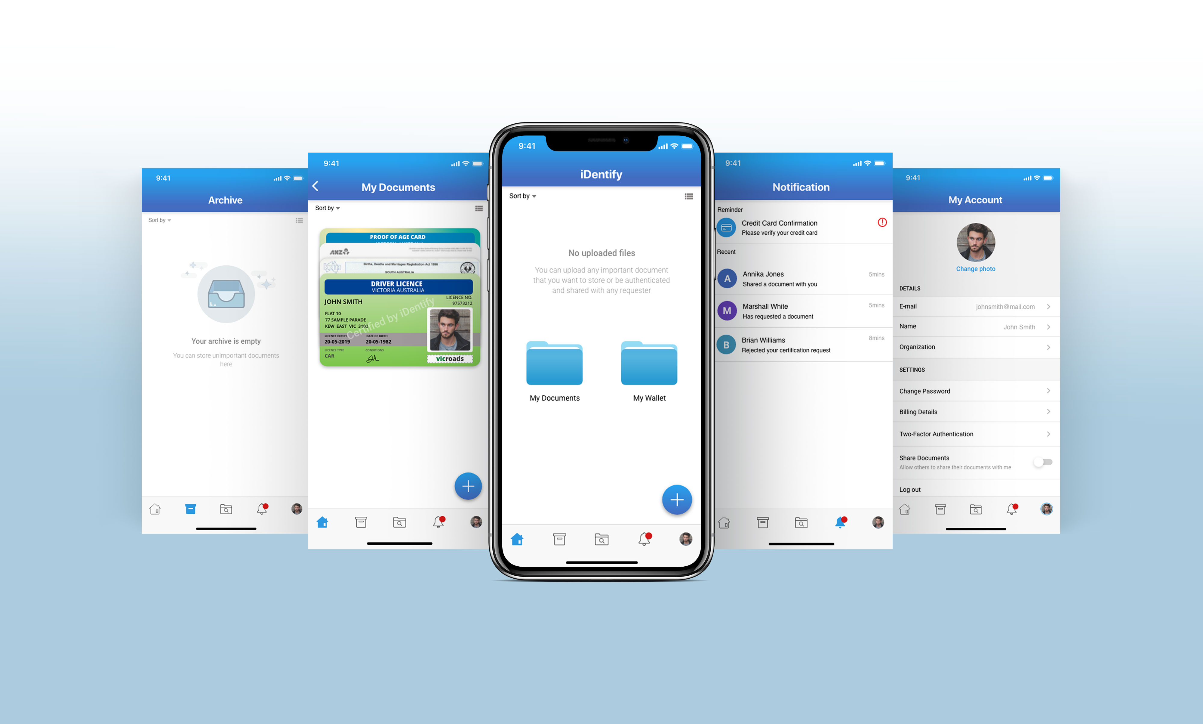
Overview
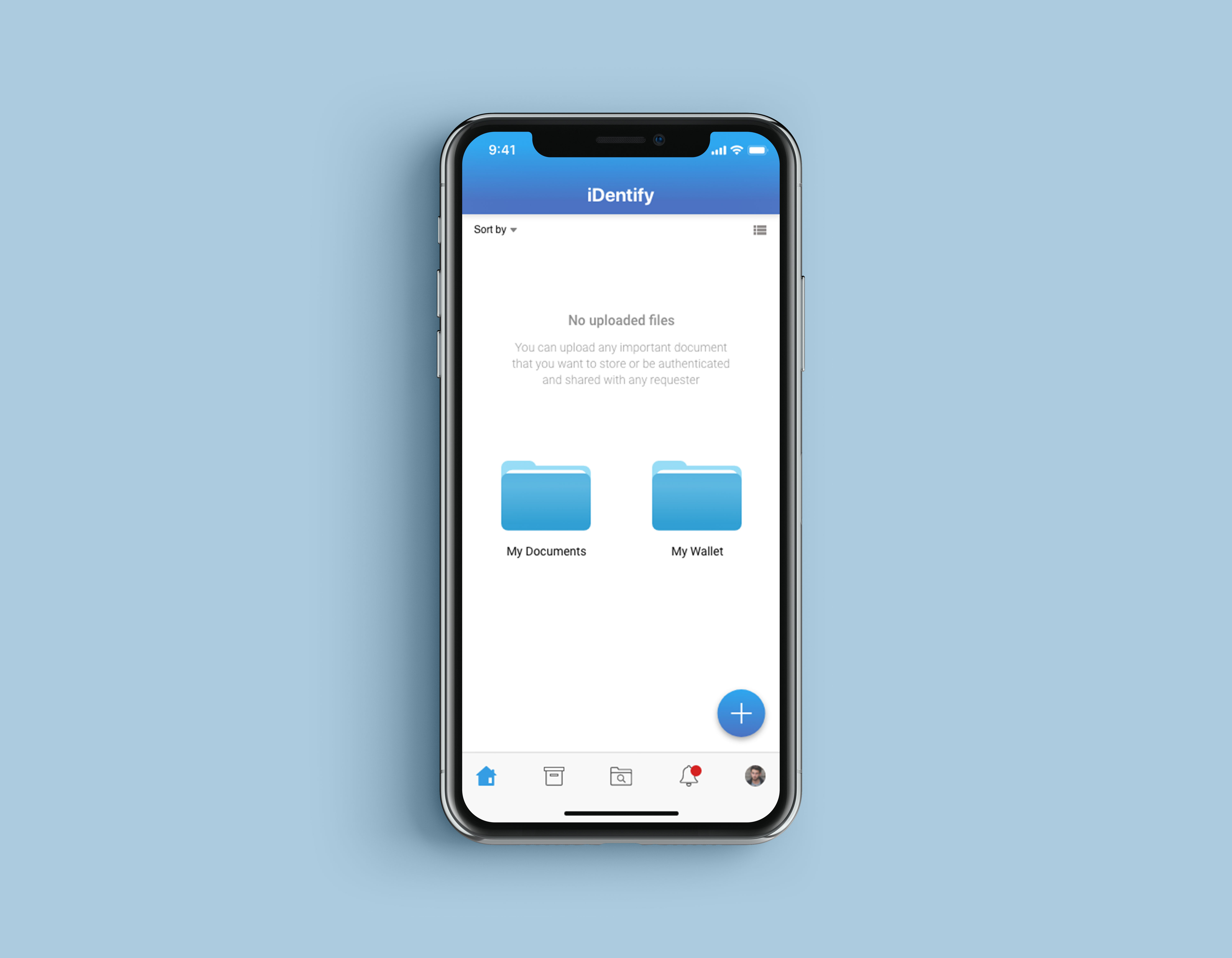
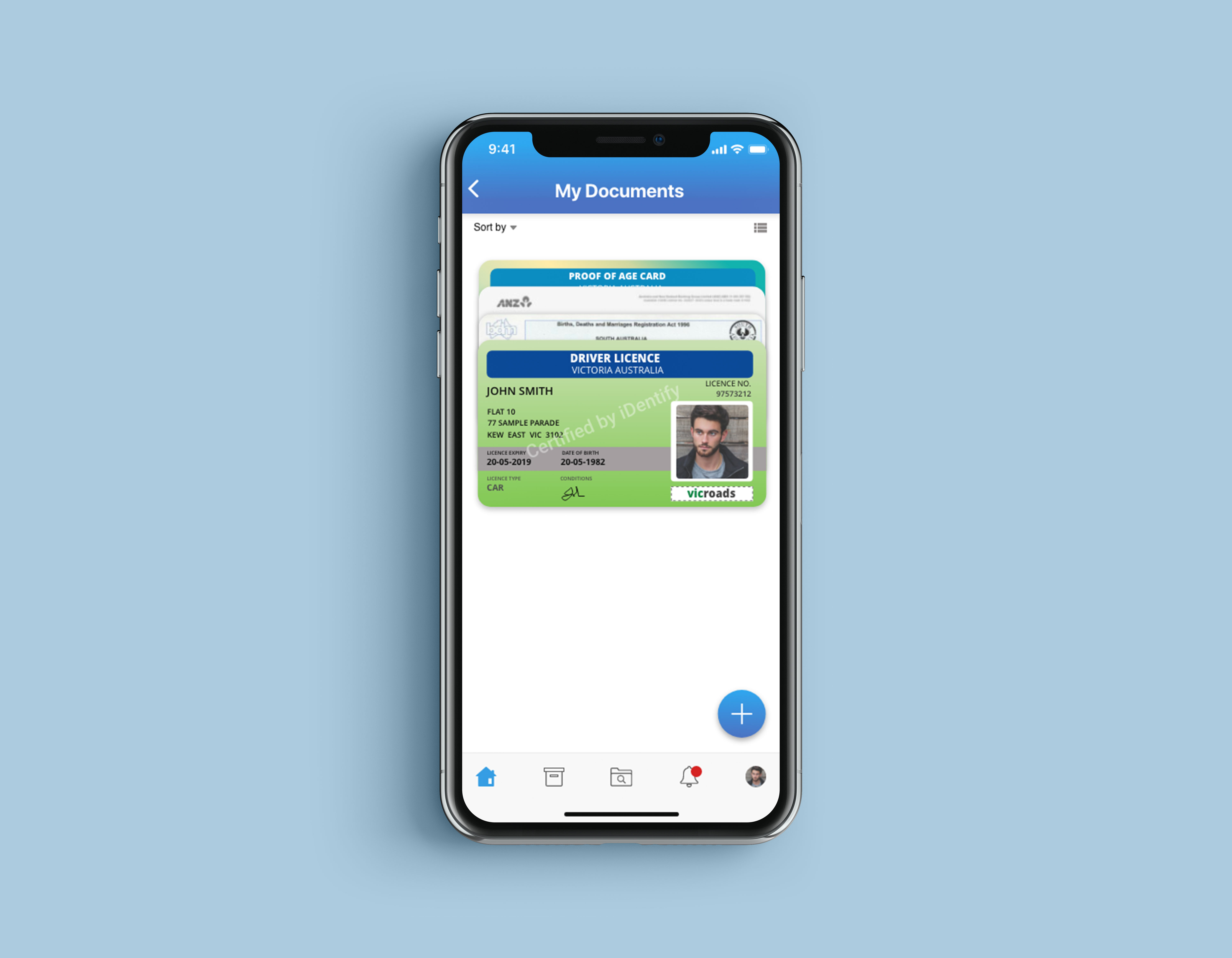
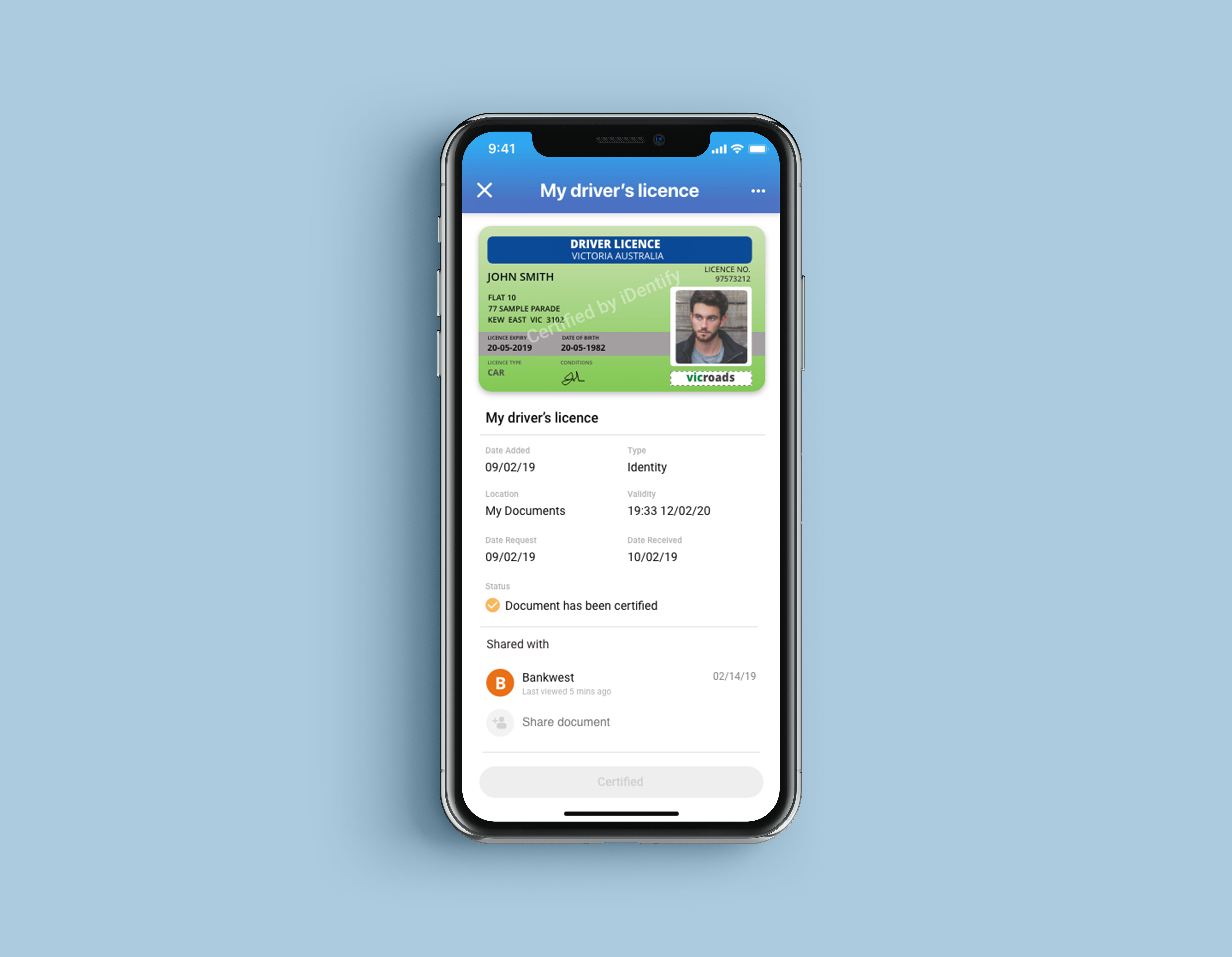
An application for people to be able to work digitally.
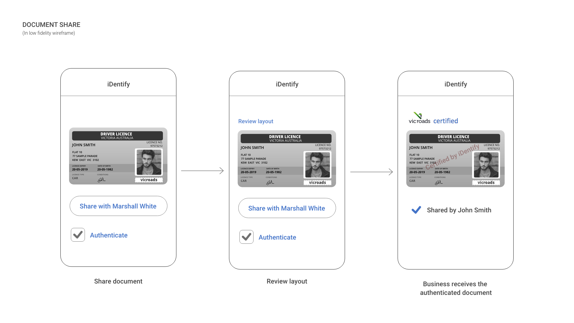
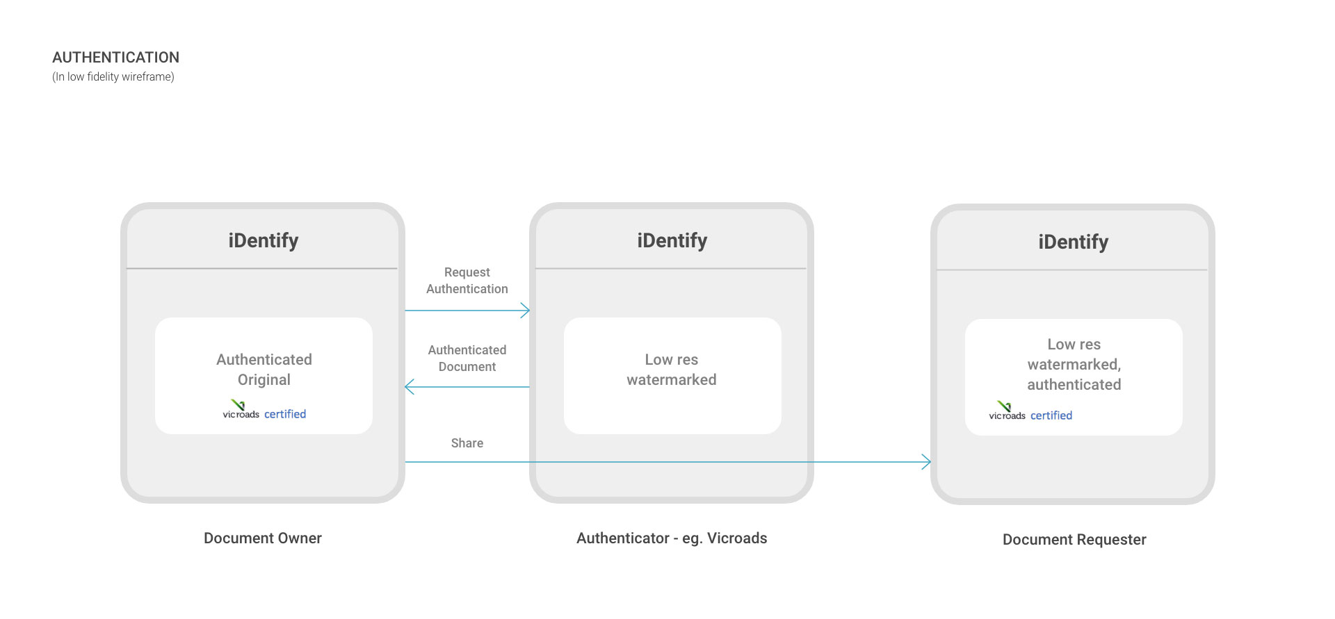
It maintains the control process and ownership of the users' documents, allowing them to effortlessly prove their authenticity that is securely stored and shared with others.

Log In

Home

×

My Documents

Document Details

×

Project Summary

Problem

The lack of method and security for managing documents —documents are often hard copy and must be tended to in person because it's tedious and can be quite a pain in the butt for some. The more parts of a process take place over the paper that can be prone to damage and being misplaced. Imagine the hassle of having to start over at square one getting the information back? Also, there are people out there who can commit acts of forgery on a much larger scale. For instance, the client applies for a mortgage with falsified bank statements, then the bank approves loans, but the client fails to meet repayments. Therefore, it can quickly lead to a conflict between the customer and the business.
My role
For this project, I primarily worked on the user experience design for an Australian company that allows individuals to own and manage their medical screening and examination records. This enables individuals to be job-ready, as their medical information is up-to-date and readily available for any potential employer. I have collaborated with their team from different parts of the world as we rack our brains to come up with the best possible solutions. The client knew what goals I should accomplish and who their user base would be.
Personas
They had a chance to interview a few people from their location as part of the research. I'd gathered all the necessary information and been able to concoct these personas and all the other design deliverables.
The need of document sharing
Concept
iDentify's main functionalities are to store, authenticate and share documents. The client was patient enough to answer all my questions and had explained to me everything I needed to know about the project. So we were able to work together efficiently through brainstorming and requirements refinement.
Share concept Authentication
Sketches
Now, this is the tricky fun part of the process that made me stay up late because working in the wee hours is my most productive time for creativity. I'd usually listen to a ton of good songs in my playlist and drink a couple cups of tea to keep my brain active. The fun thing about sketching is that, you get to enjoy gathering ideas and digging deeper into things just like solving the puzzles. So I sketched the hell out of it to figure everything out based on the specifications and analysis in the early stage of the project.
sketches
User flows
The user flow took place after I created a series of sketches to evaluating the intuitiveness and keeping the discussion about the design itself. This method helps me to map out the intended flow for each step from the entry point right through the final interaction. The image below covers the login, registration and newly registered user flow for the android version.
userflow
Wireframes
So basically throughout this stage, I just converted all my sketches into low fidelity wireframes. Then when I had a clear idea of the flow, that's a time where we worked on the information architecture. I created high fidelity wireframes to help us determine the intended functionality in the interface. The trouble here sometimes is many other clients are unfamiliar with wireframes. Thus, they tend to skip this crucial part of content planning and would prefer to proceed with the mock-ups to speed up the process. Relatively speaking, it wasn't the case with my client. I was able to help them understand the value of wireframes during discussions. I made sure they feel included and engaged with the process. In short, everybody has a clear vision of where the design is heading. So the illustration below shows the UI structure of the application.
userflow
Mockups
The integral part where the client gets the idea of what the final product can look like before the implementation. If you have the time and resources, mockups are the best way to explore visual design decisions. So how did I come up with this mockup design? Well, my client provided me a color that they wanted to use for the product which is the color blue. That's when I began to play around with blue color palettes and see which hex is best suitable. I'd collected some design concepts from the internet and downloaded a few related mobile apps that I could use as references. I managed to give them design options. So the image below is what they had chosen and we implemented.
sketches welcome screen
Prototypes
Let's switch to dark mode. I'd sunk countless hours and days working on these deliverables. It's a good thing that clickable prototypes is certainly my cup of tea, I must say. The joy of every UX designer gets from connecting each screen to another, putting animations to form a simulation or sample version of a final product that is used for testing and development before launch is all worth it. The videos below show how to navigate the application.

Sign Up

Upload and Share

Certify

Tools I used: