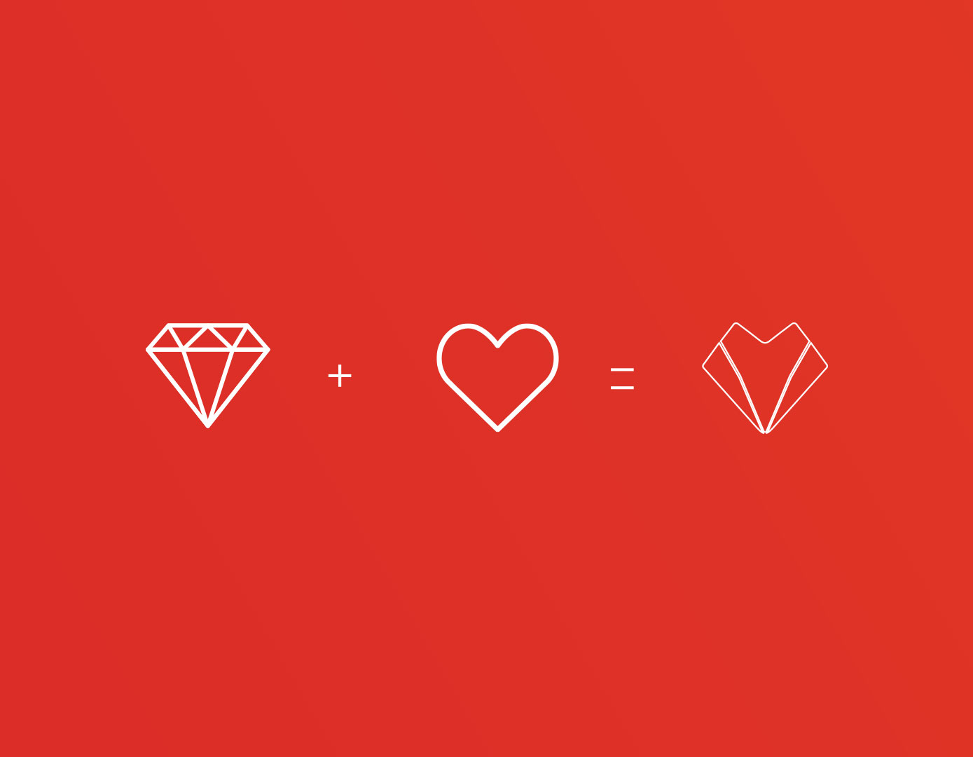
Concept
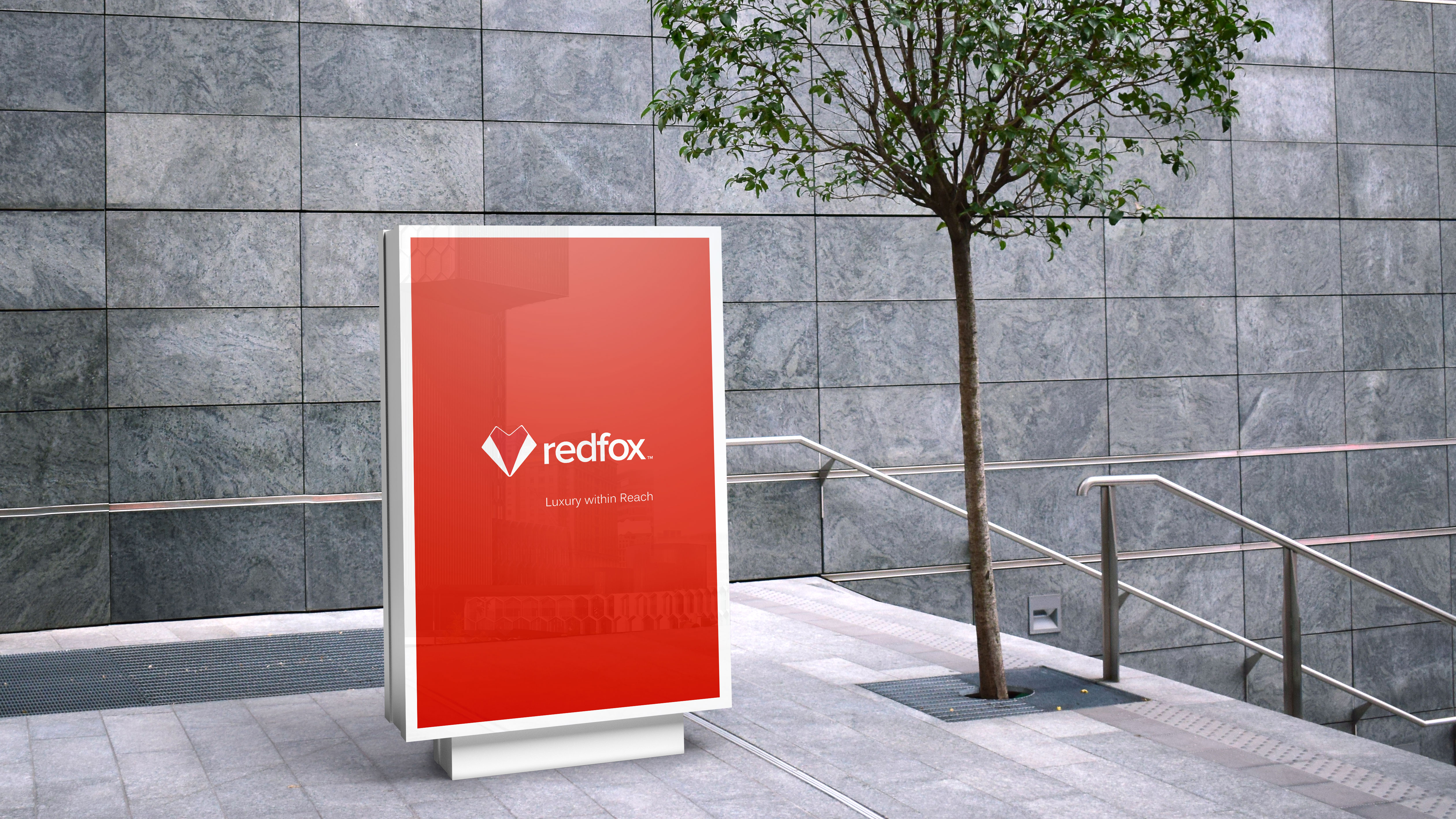
The Redfox icon symbolizes the diamond shape for luxury and heart for hapiness. This is to comunicate that Redfox will provide luxurious products within reach for everyone.
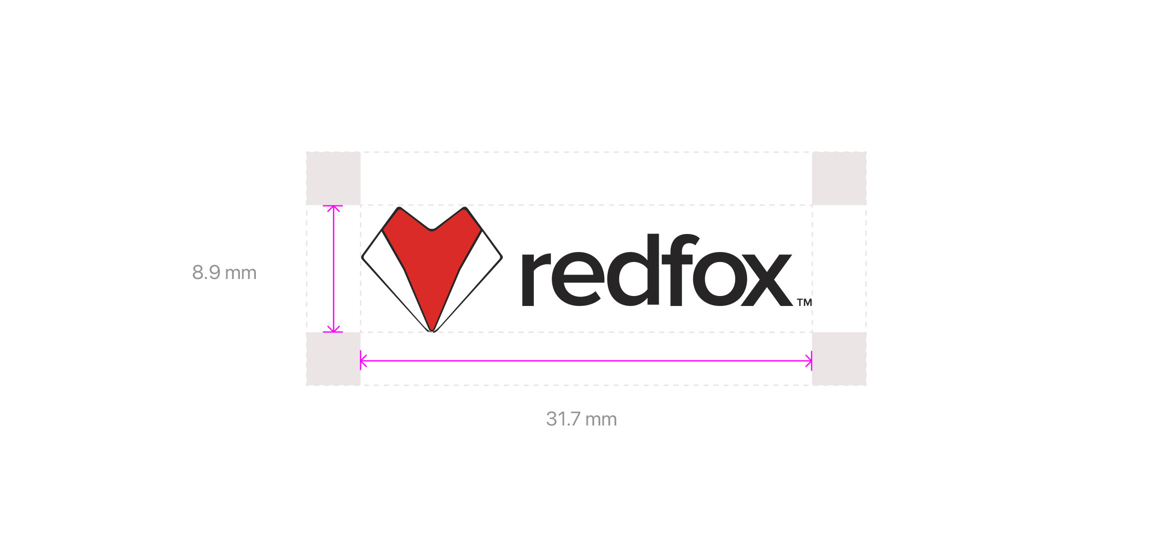
Logo Size & clearspace
To ensure the legibility of the Redfox corporate logo, a minimum size has been determined, but it can also be upscaled proportionally. However, the Redfox corporate logo cannot be smaller than 25.5 mm in width and the preferred logo size is a minimum of 31.7 mm in width. For the icon, the size cannot be smaller than 19.05 mm in width and prefered icon size is 25.5 mm. Consistent color usage across all media is essential to the integrity of the Redfox brand. No other color specifications should be used.
Colours & Typography
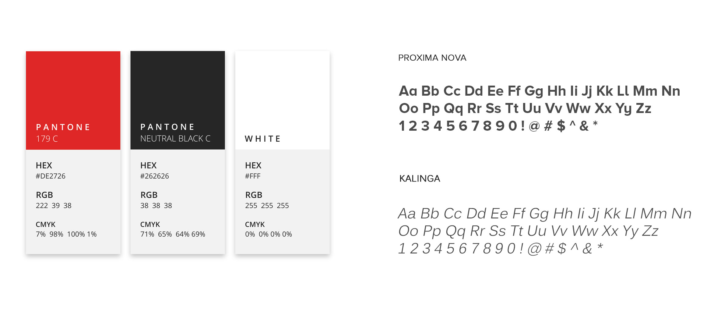
The Redfox brand uses three primary colors and two specific fonts for its corporate logo and tagline to make it look modern and edgy.
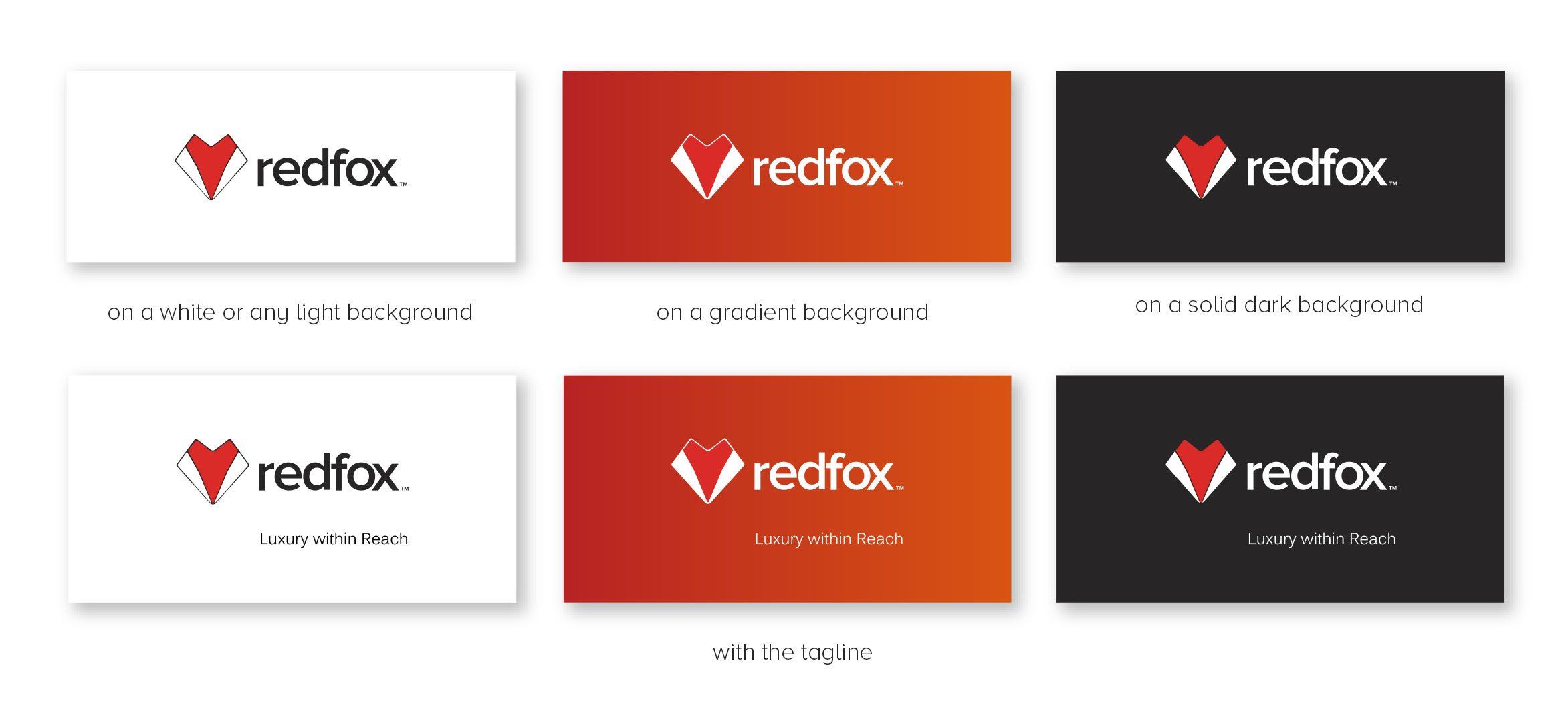
Logo Options
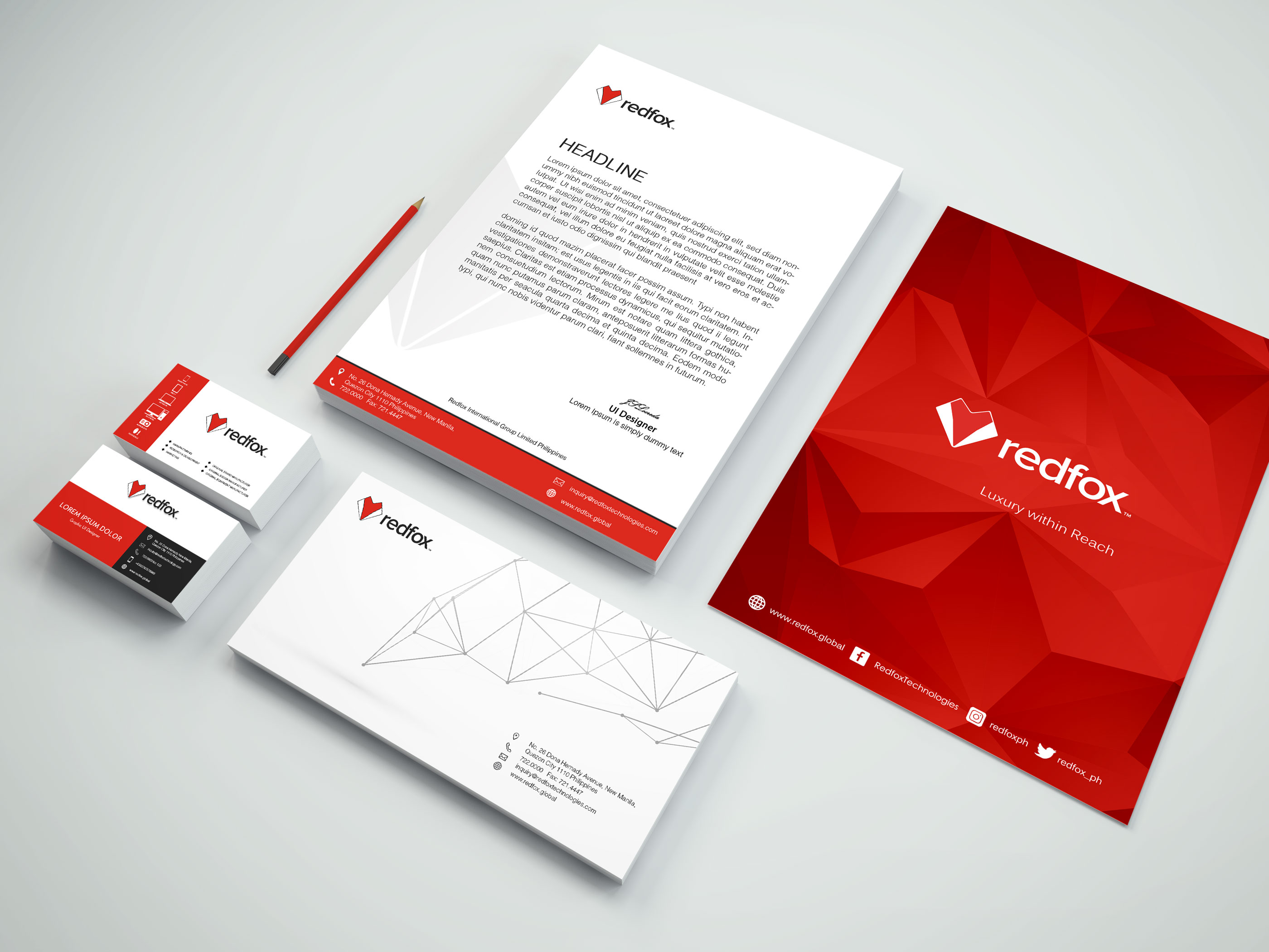
The Redfox uses logo options for its marketing materials.